iSYS Software GmbH
Redesign of Website
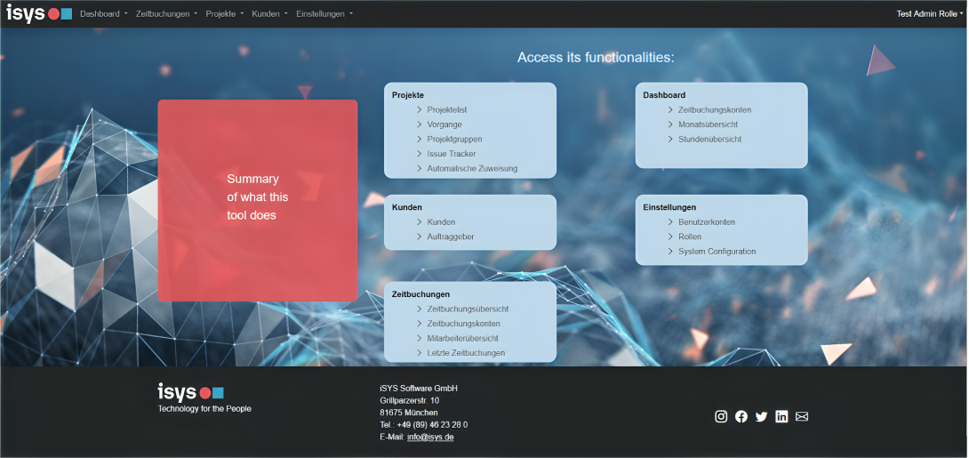
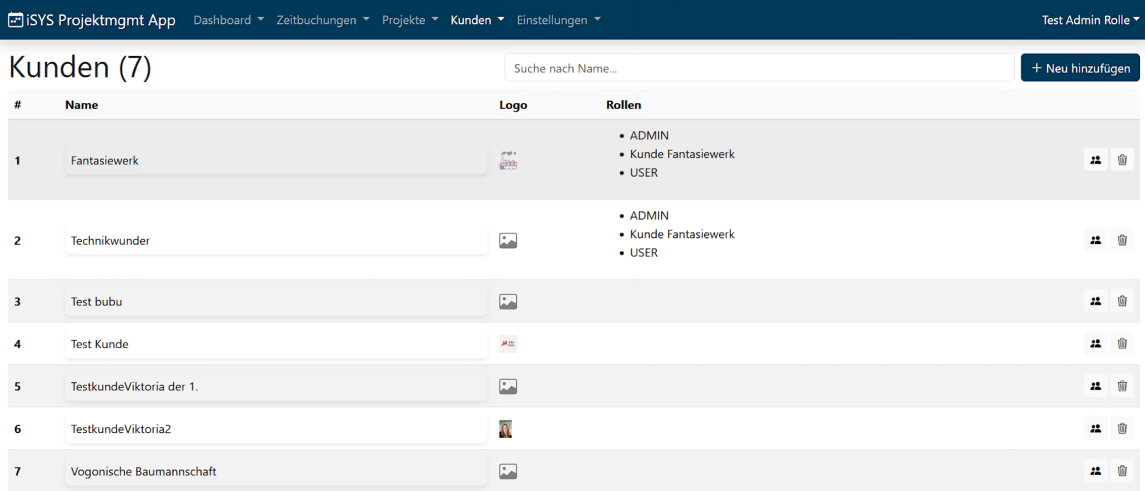
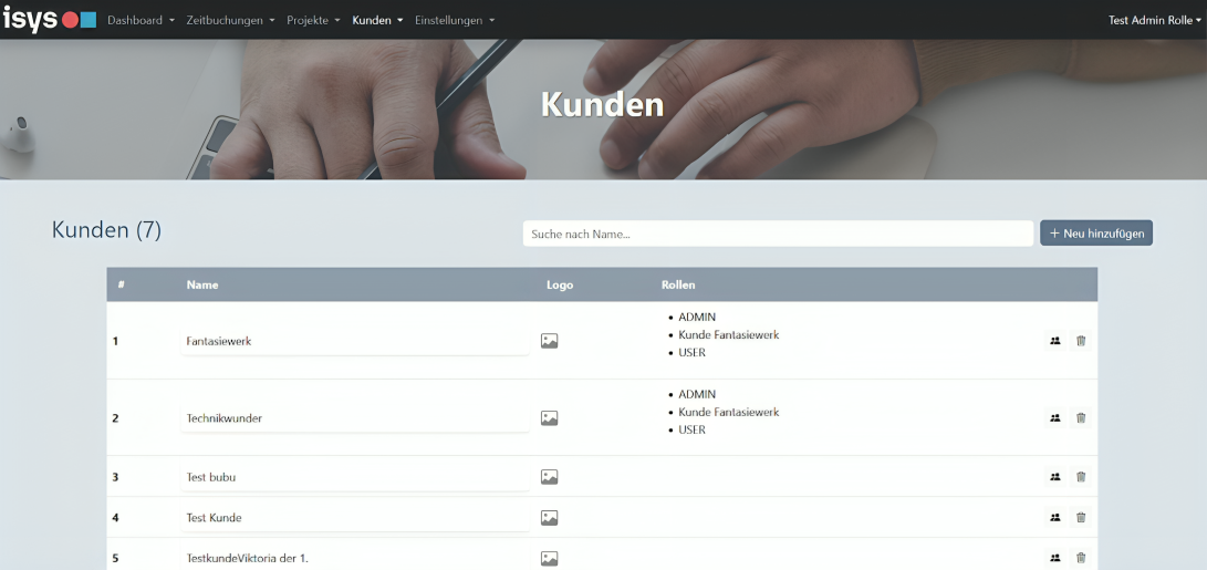
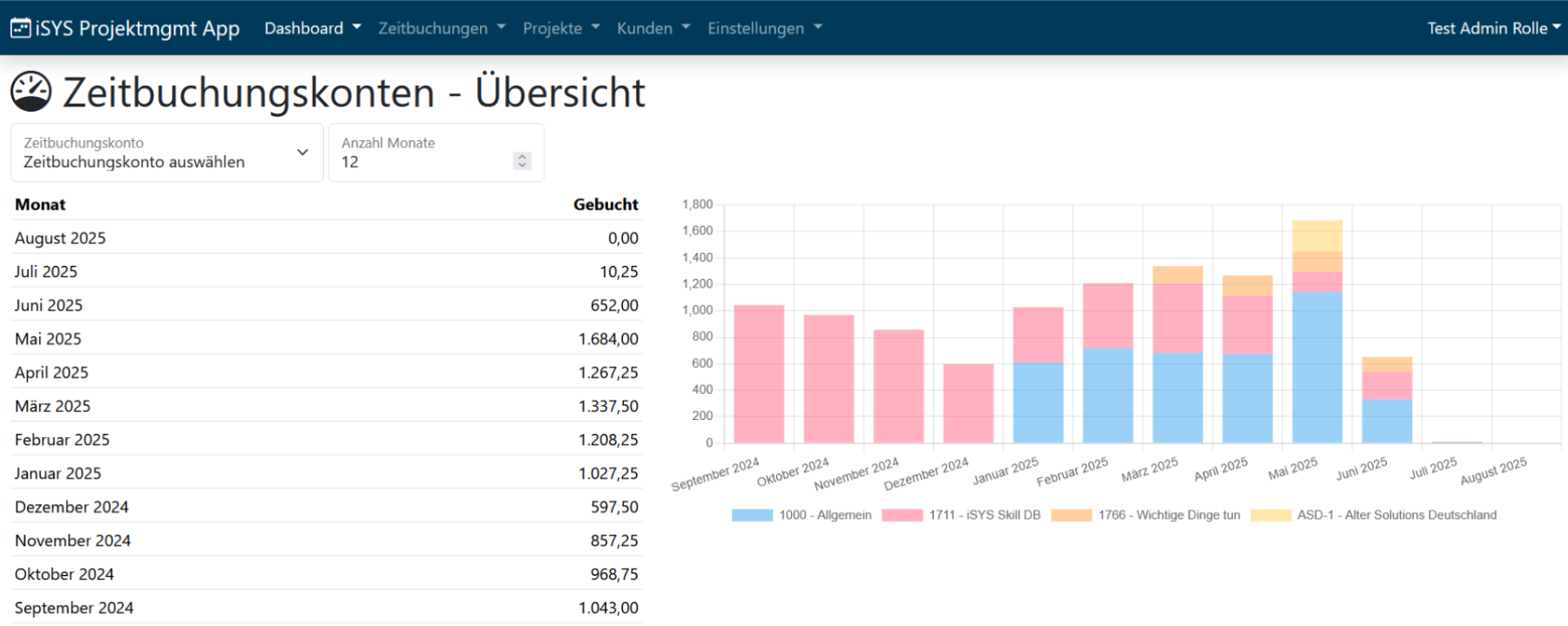
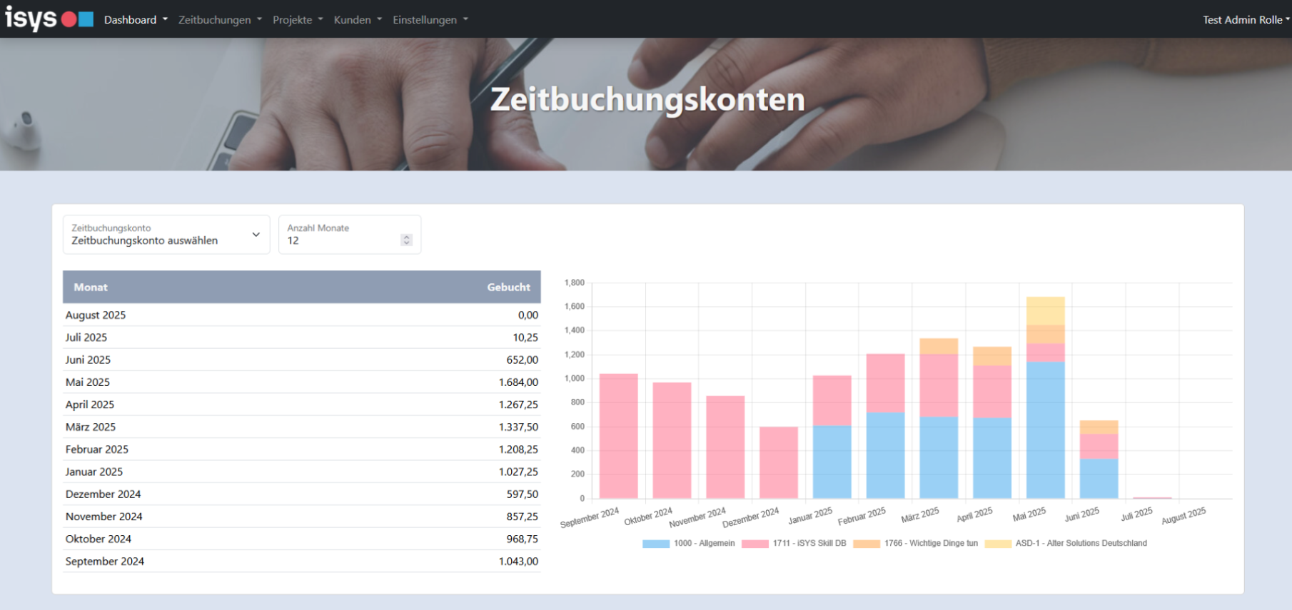
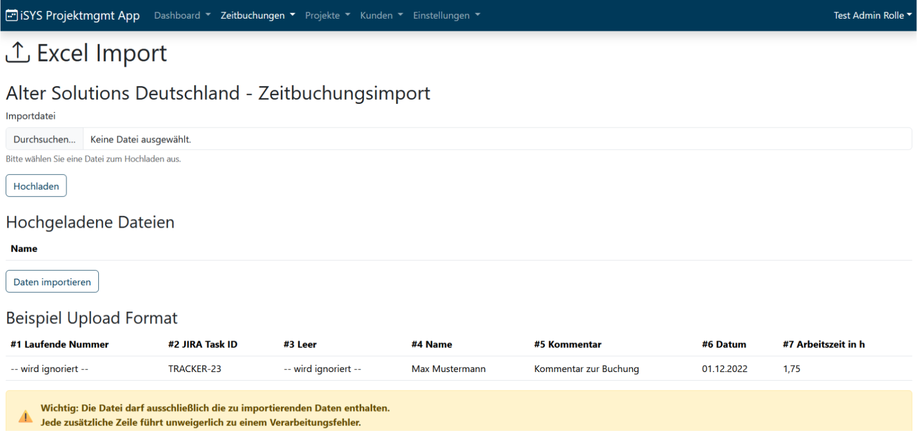
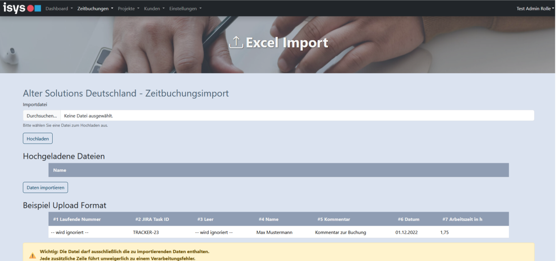
I redesigned an older product website the company wanted to rebuild. Below are the before-and-after visuals for the landing page and multiple internal pages.
Project Snapshot
Role: UI/UX Design and Front-End Development
Team: Individual contributor
Timeline: 4 months
Context
iSYS Software GmbH had an outdated product website that no longer reflected the quality of their software. They wanted a modern, credible web presence to better communicate their offering to potential clients.
My Role
I led the visual redesign end to end, defining a new component system, typography hierarchy, and layout structure, then producing the designs in Figma. I created a new landing page and redesigned 17 internal pages plus the main menu structure.
Process
I audited the existing structure, identified navigation and labeling friction points, mapped clearer page hierarchies, and iterated design directions before finalizing UI components and responsive layouts.
Outcome
The redesign covered 18 screens in total (17 internal pages plus the menu), with clearer labels, improved action placement, and a more predictable click flow. Only a subset of pages is shown here to respect company confidentiality.
Tech Stack
Figma, UI/UX design system principles, HTML, CSS, JavaScript.
Before & After